MetalPay | Make Money Better
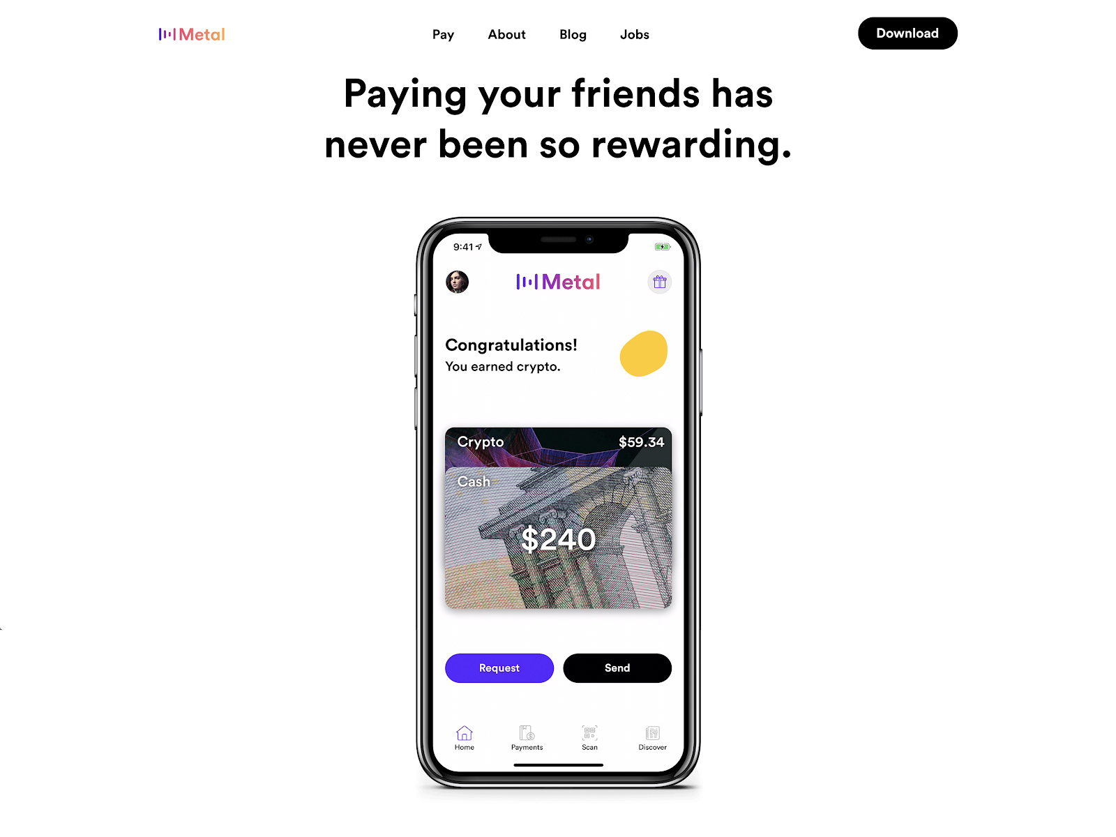
At Metal, I had direct impact on nearly all user touchpoints for a financial services app that rewards its users in cryptocurrency for paying friends. This includes improving the branding, app look and feel, managing the social media presence, concept and development of ad campaigns, including copywriting and design. Through many of my efforts, the user base grew by over 3000% in the first year since its launch.
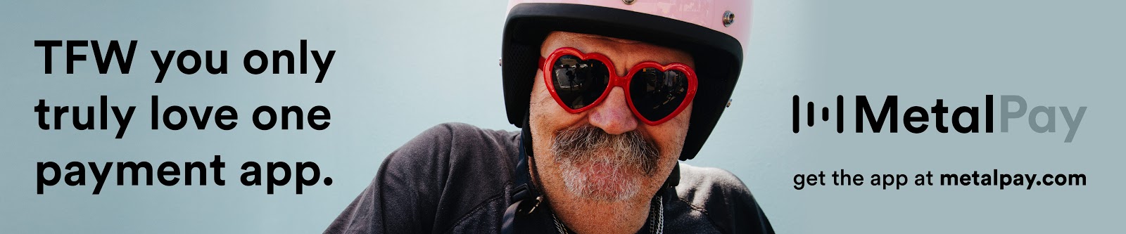
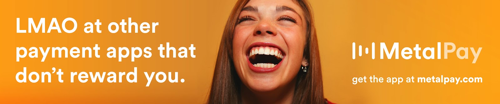
The Feels was a proposed billboard campaign based on popular abbreviations for feelings of enjoyment. It’s a quick, playful message that communicates the joy of earning money back when paying friends.
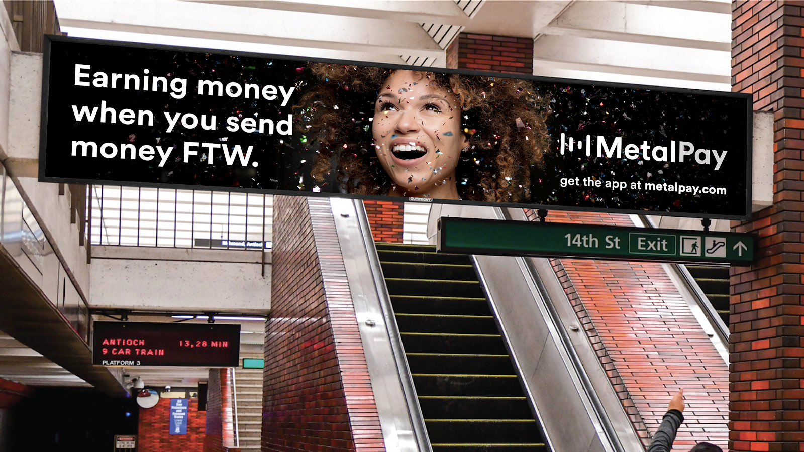
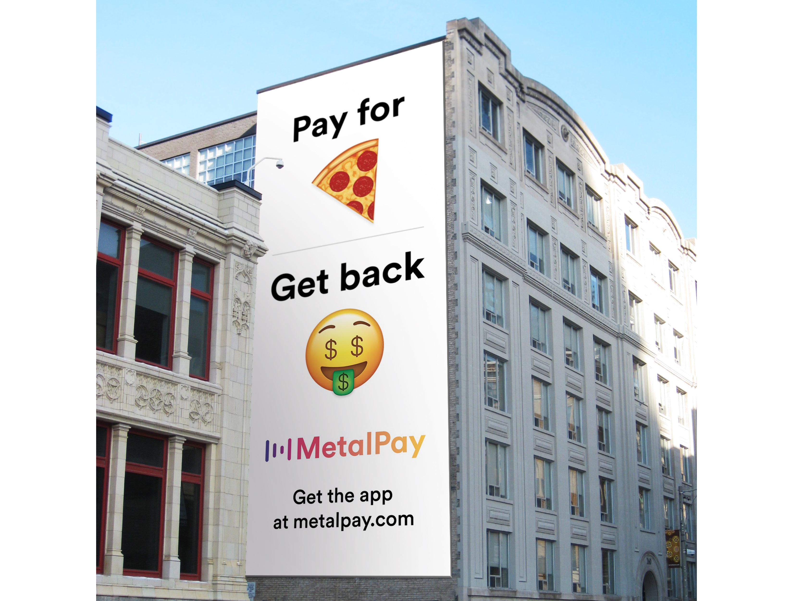
When it was determined that we didn’t have the budget to run a full takeover of a train station, but we did have an opportunity to run a single vertical billboard on the side of a building in San Francisco, I went back to the drawing board and produced a simplified concept that explains the core feature of the app using four words and two images.
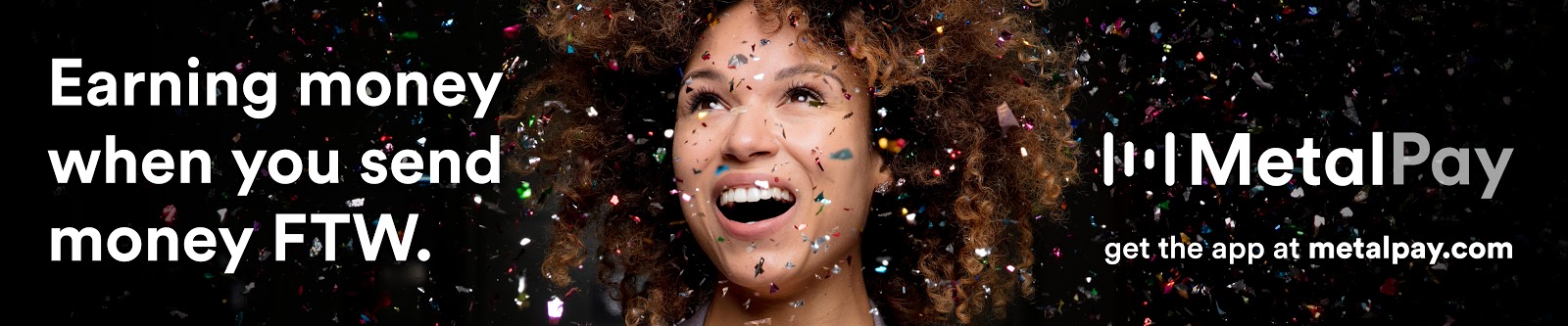
The Pay Back ad feels like the app itself, in which users send money to friends, often accompanied by an emoji in the message, and receive a reward.
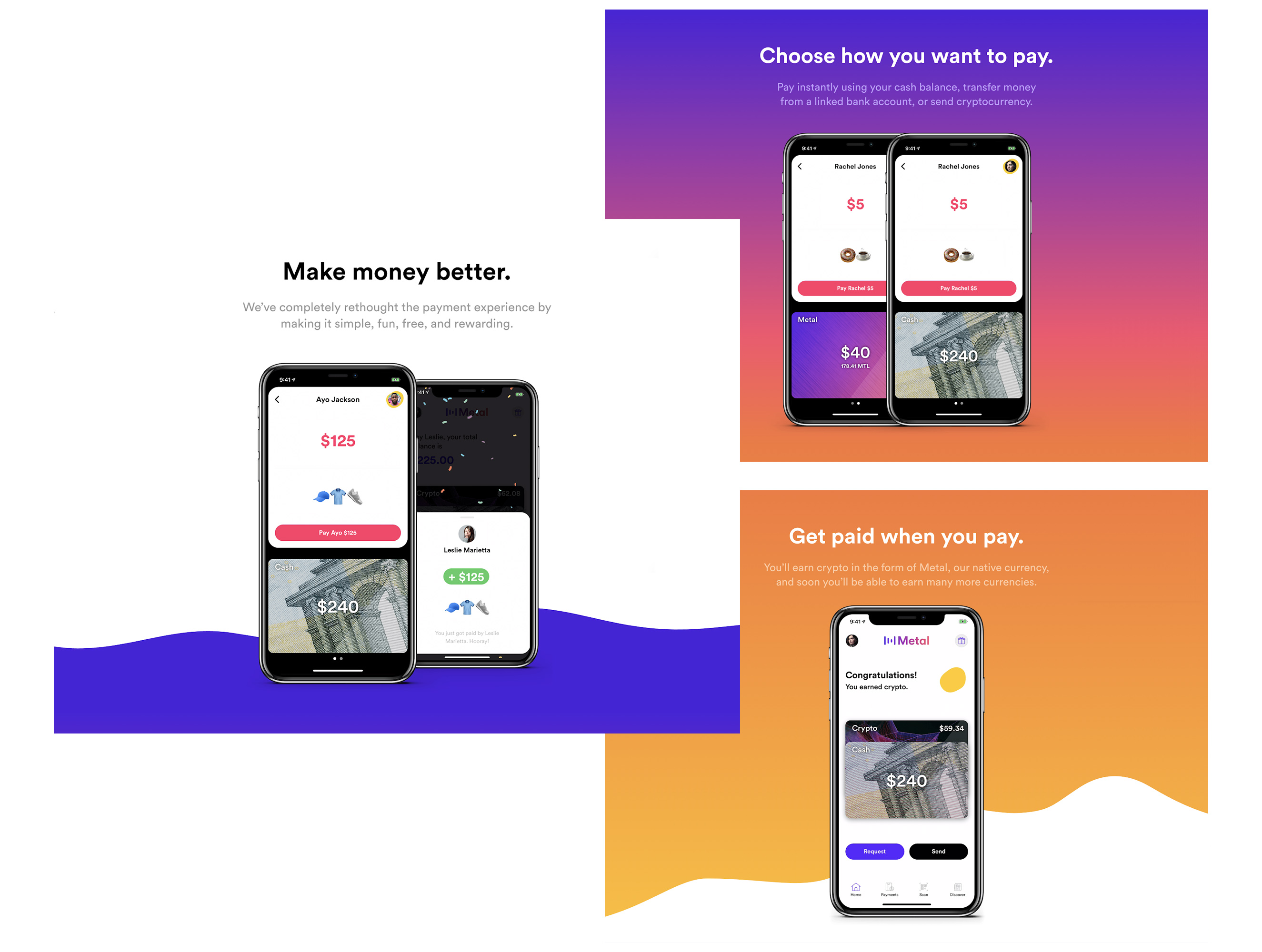
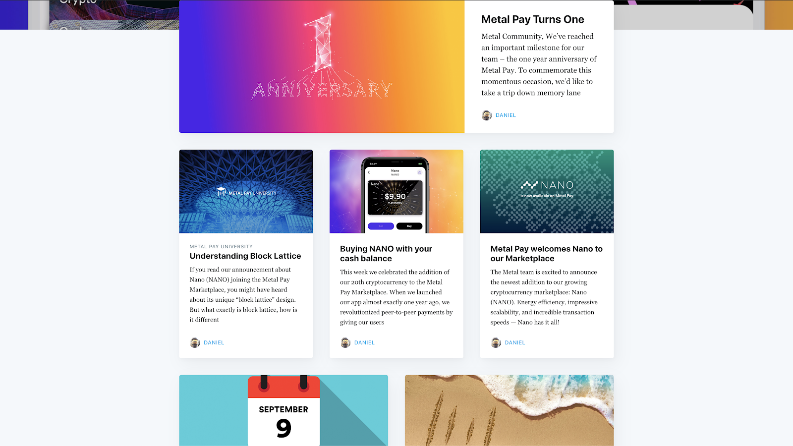
I was also a frequent contributor to updates to the Metal Pay app and website, creating both visual and written content. I frequently wrote blog posts to introduce new features, events, and products. I researched numerous technologies and protocols to help explain their value propositions in a simple way that everyday users could understand in a few paragraphs.
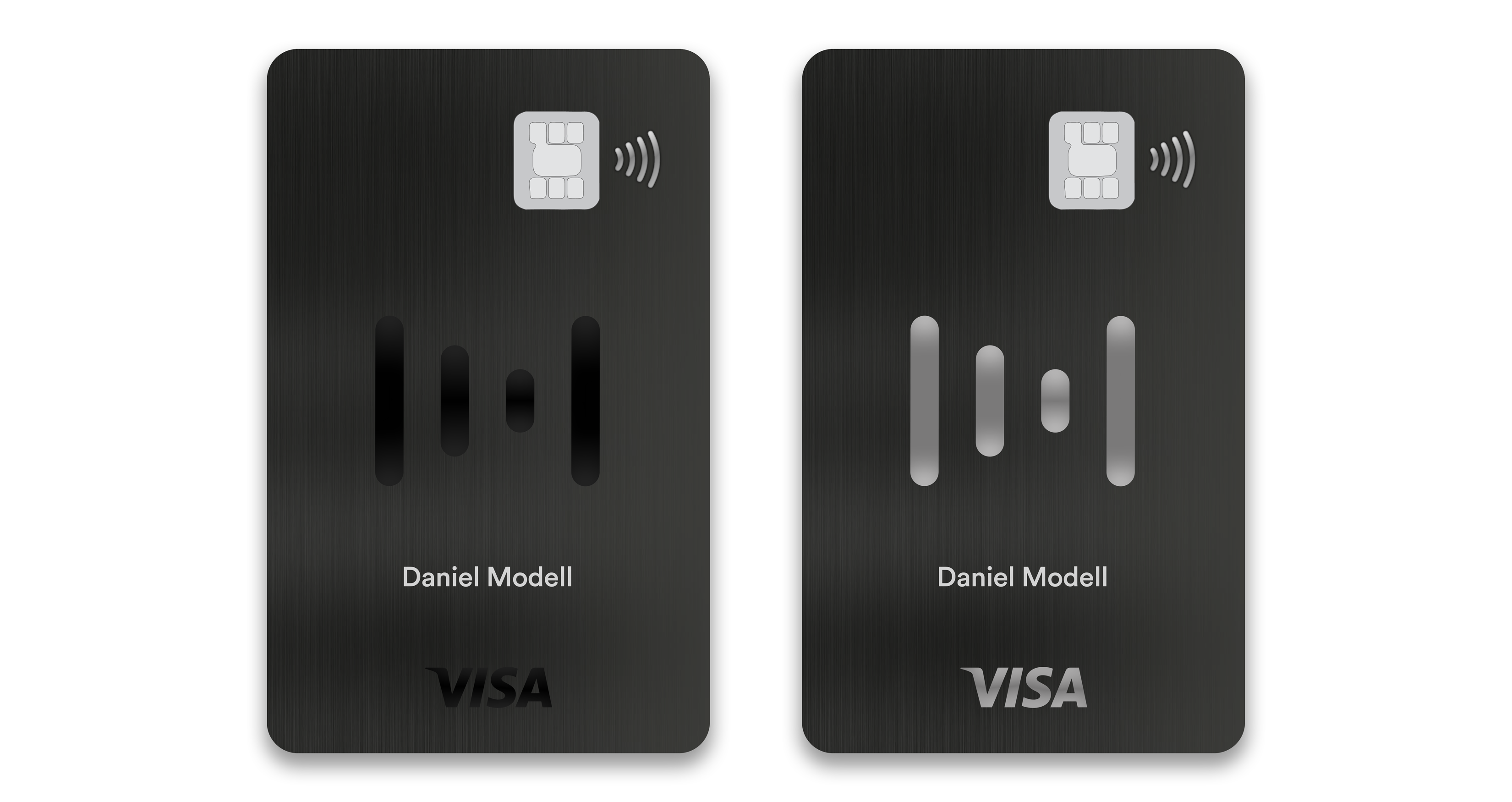
Prototype design for the Metal Visa Debit Card:
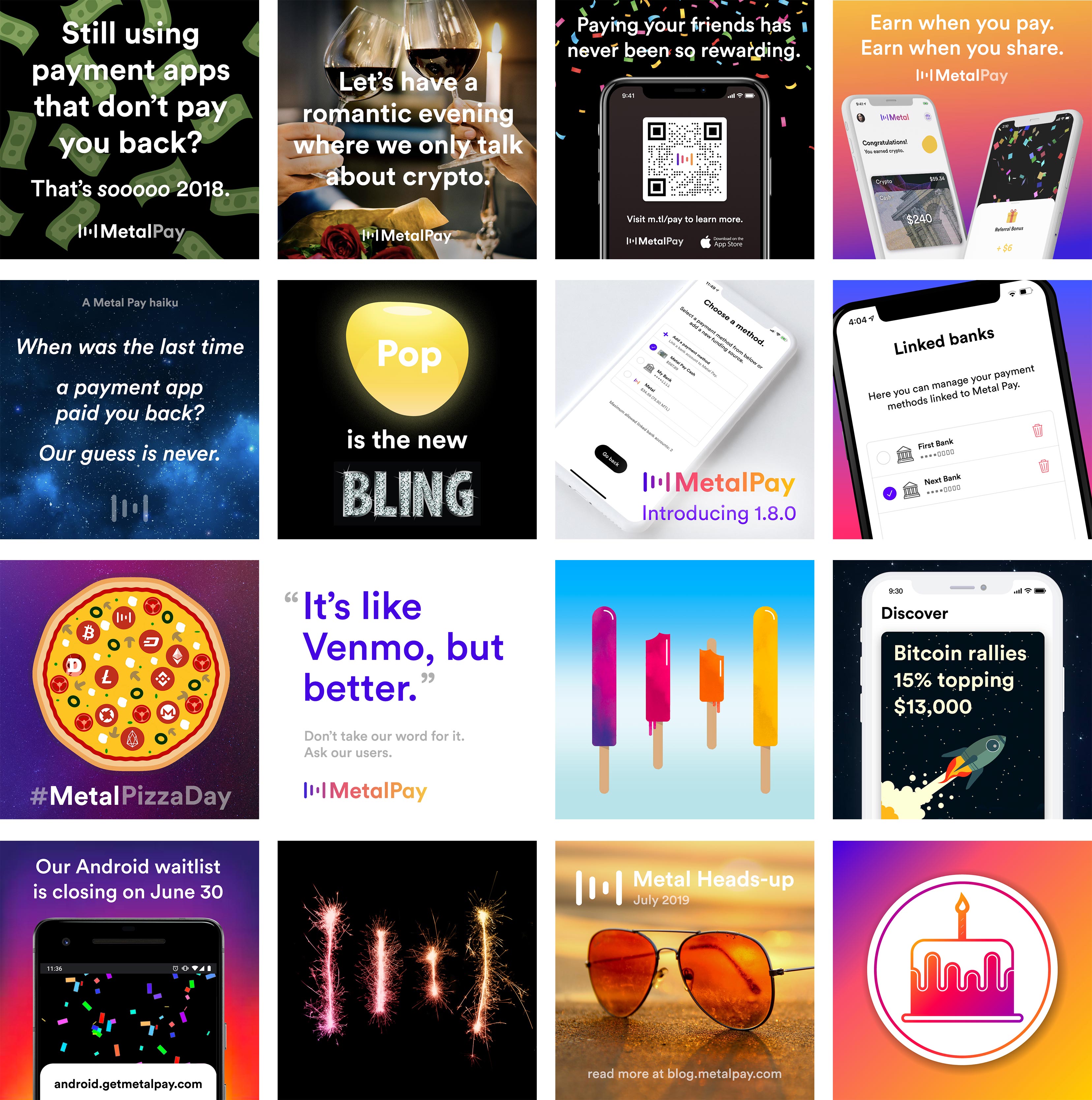
Social media highlights:
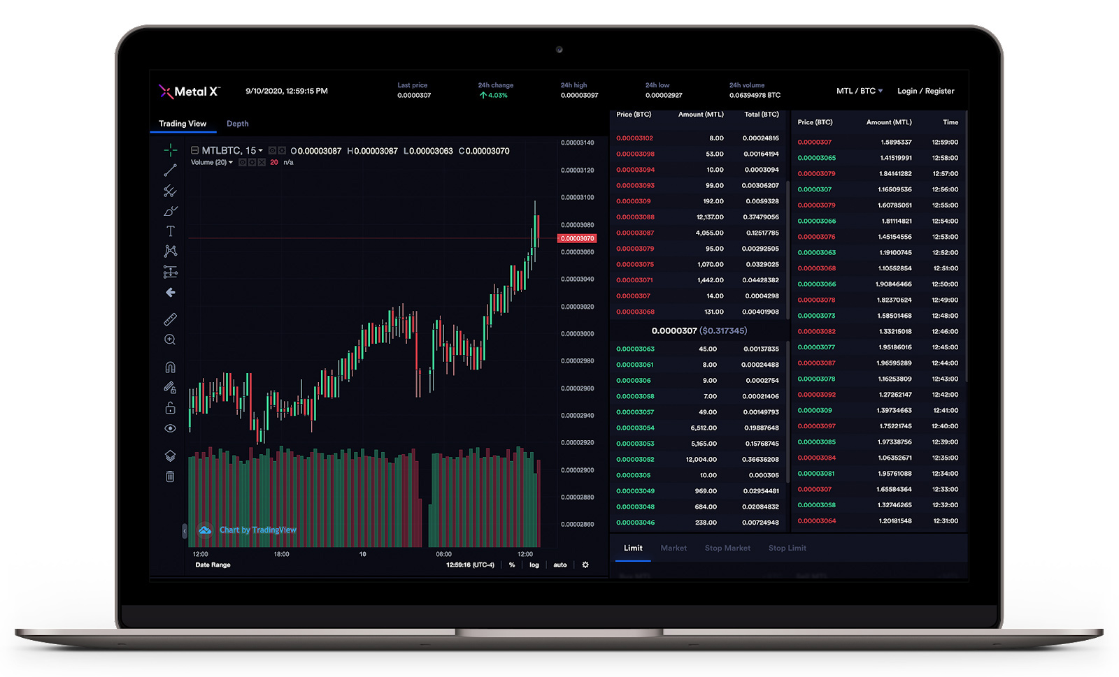
In late 2019, Metal launched its second product, the Metal X cryptocurrency exchange, designed for a user base of more experienced traders.
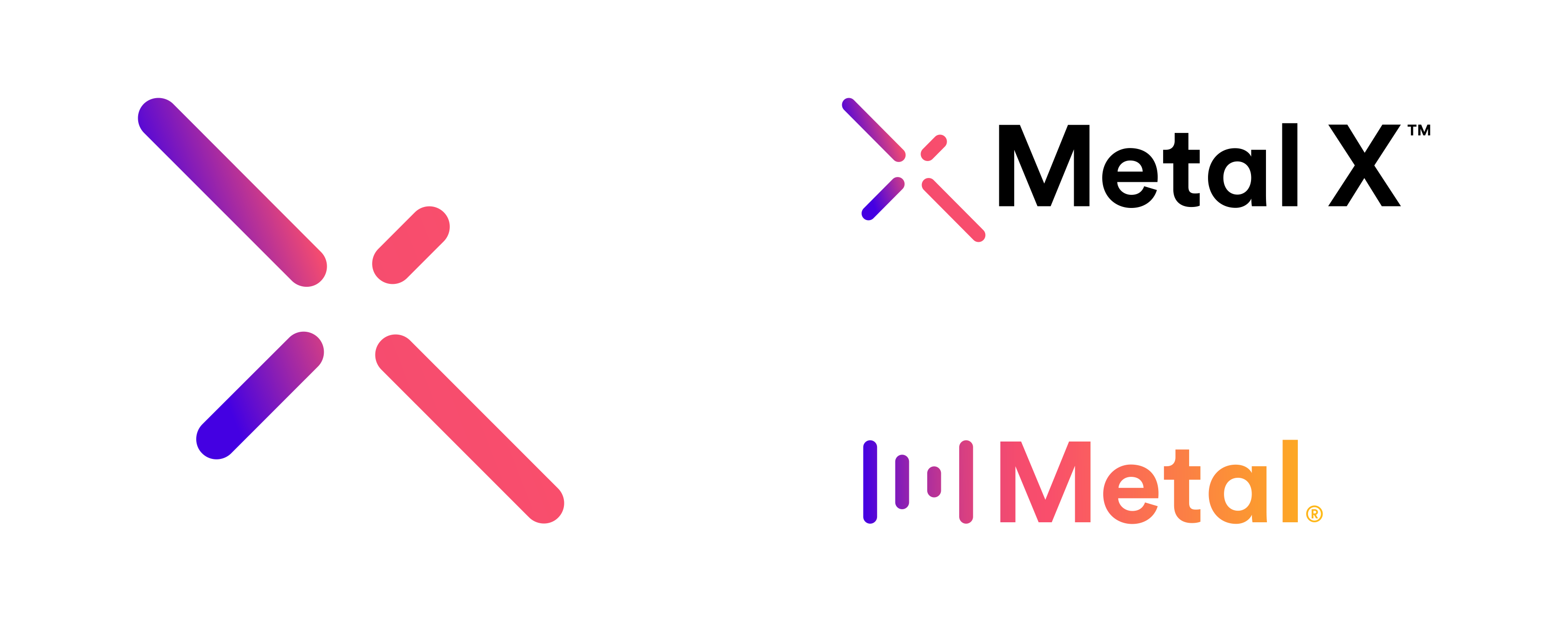
The mark is a reimagination of the original Metal logo, using the same four basic lines, but in the shape of an X, along with a unique color palette.
This teaser animation was played on social media:
A mock-up of the branded prototype exchange platform: