Orthosnap | A Precise Fit
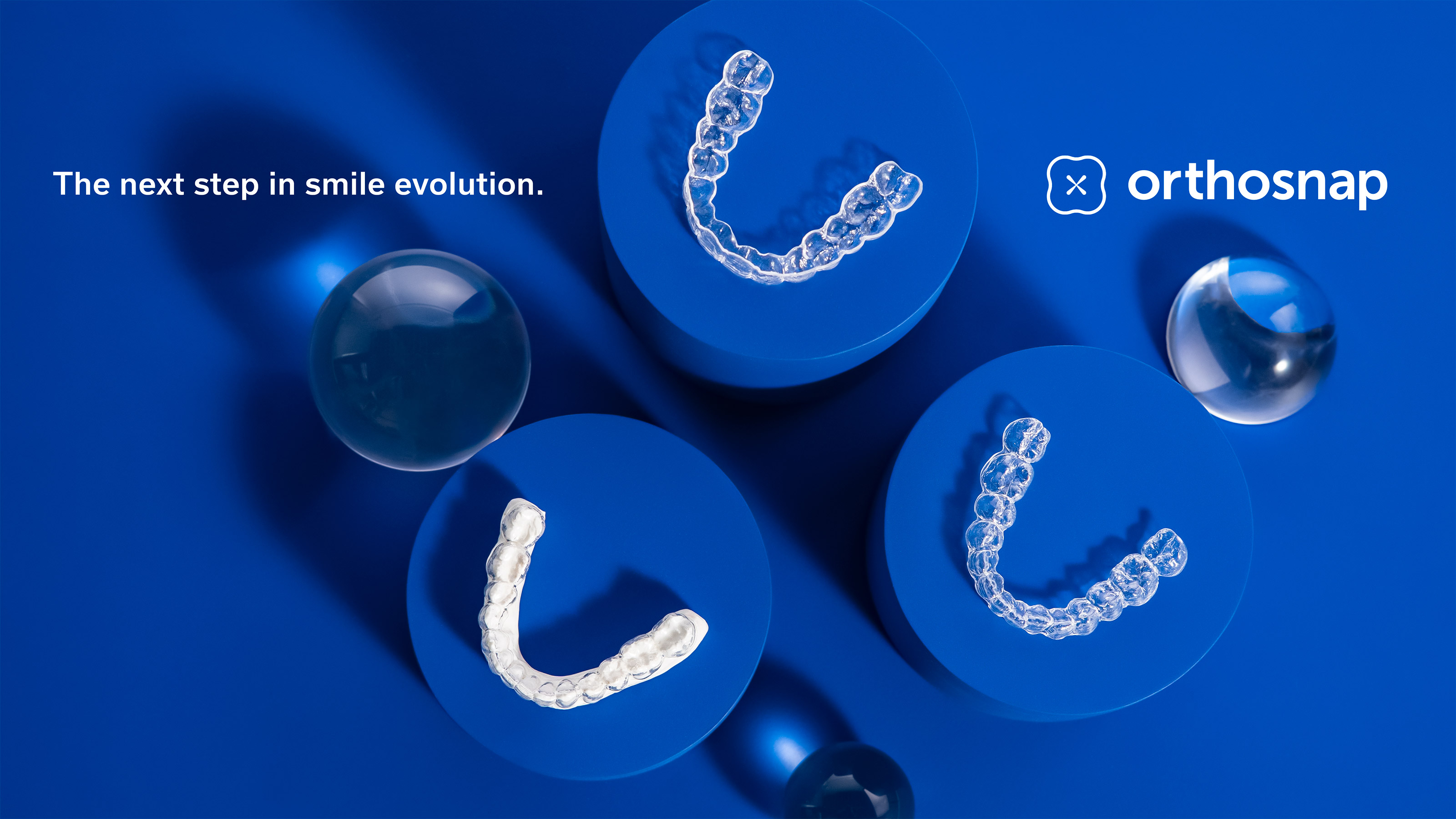
The rebrand of Orthosnap, an emerging provider of clear tooth alignment products, was a design study built on extensive research to capture the attention and business partnership of a precise and demanding audience: the dentist.
As this company does not sell products directly to consumers, the solution demanded an elevated and technical, yet approachable look and feel.
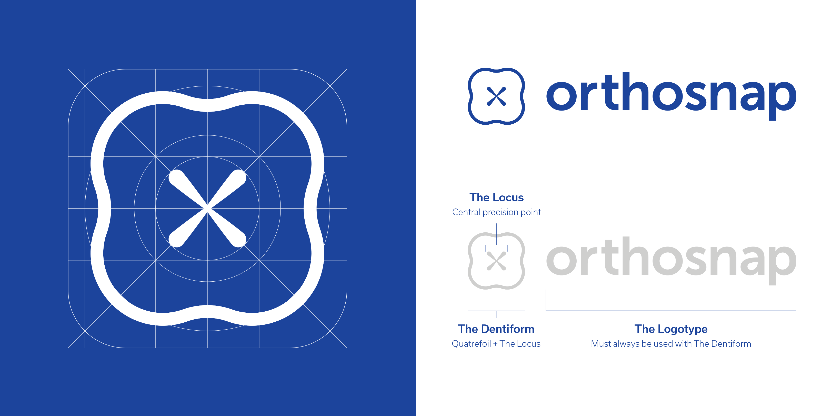
The Orthosnap logo mark is formed from two unique shapes, a rounded quatrefoil, symbolizing balance and good health, and a crosshair that focuses the eye on the mark and communicates pinpoint accuracy.
The shape is based on the fundamentals of sacred geometry, and conveys balance, perfect symmetry, and precision, while simultaneously representing the form of a tooth, as viewed from above.
Inspiration:

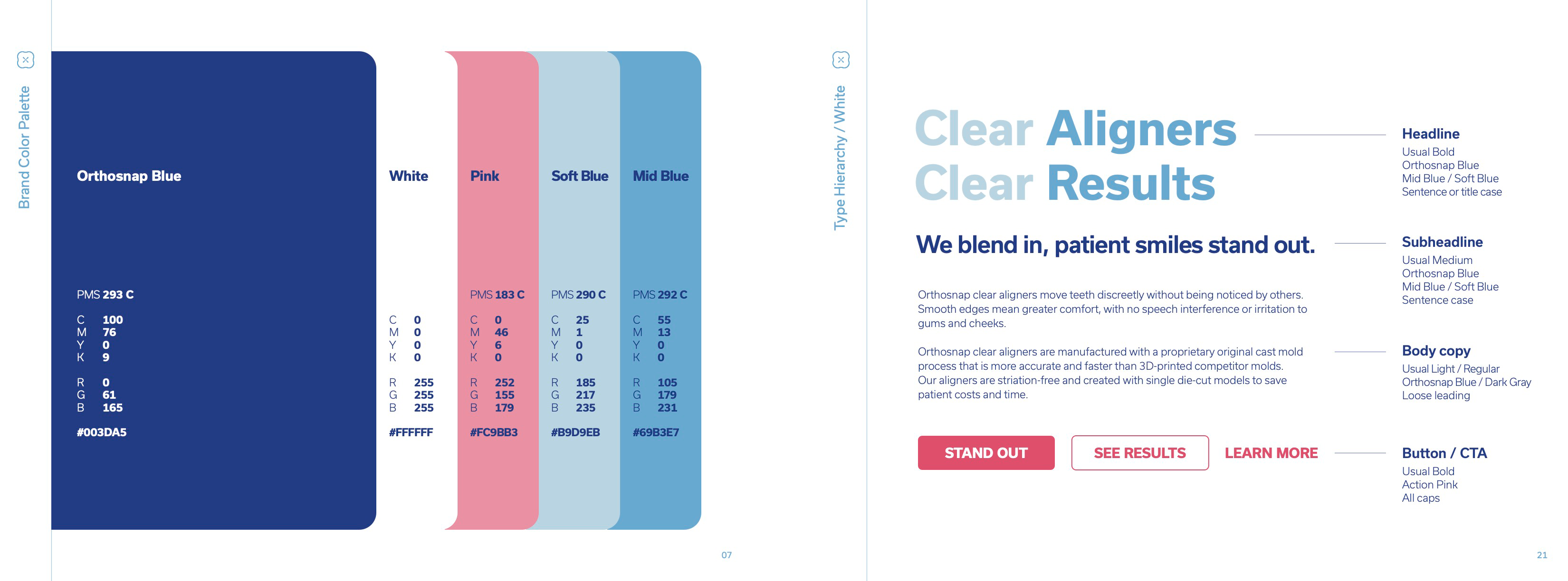
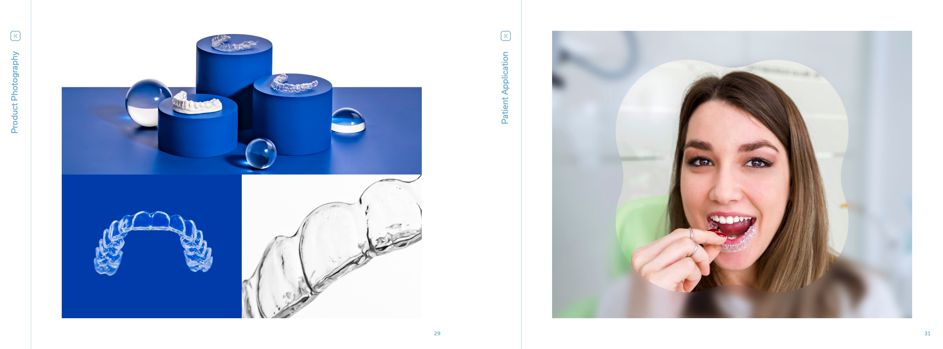
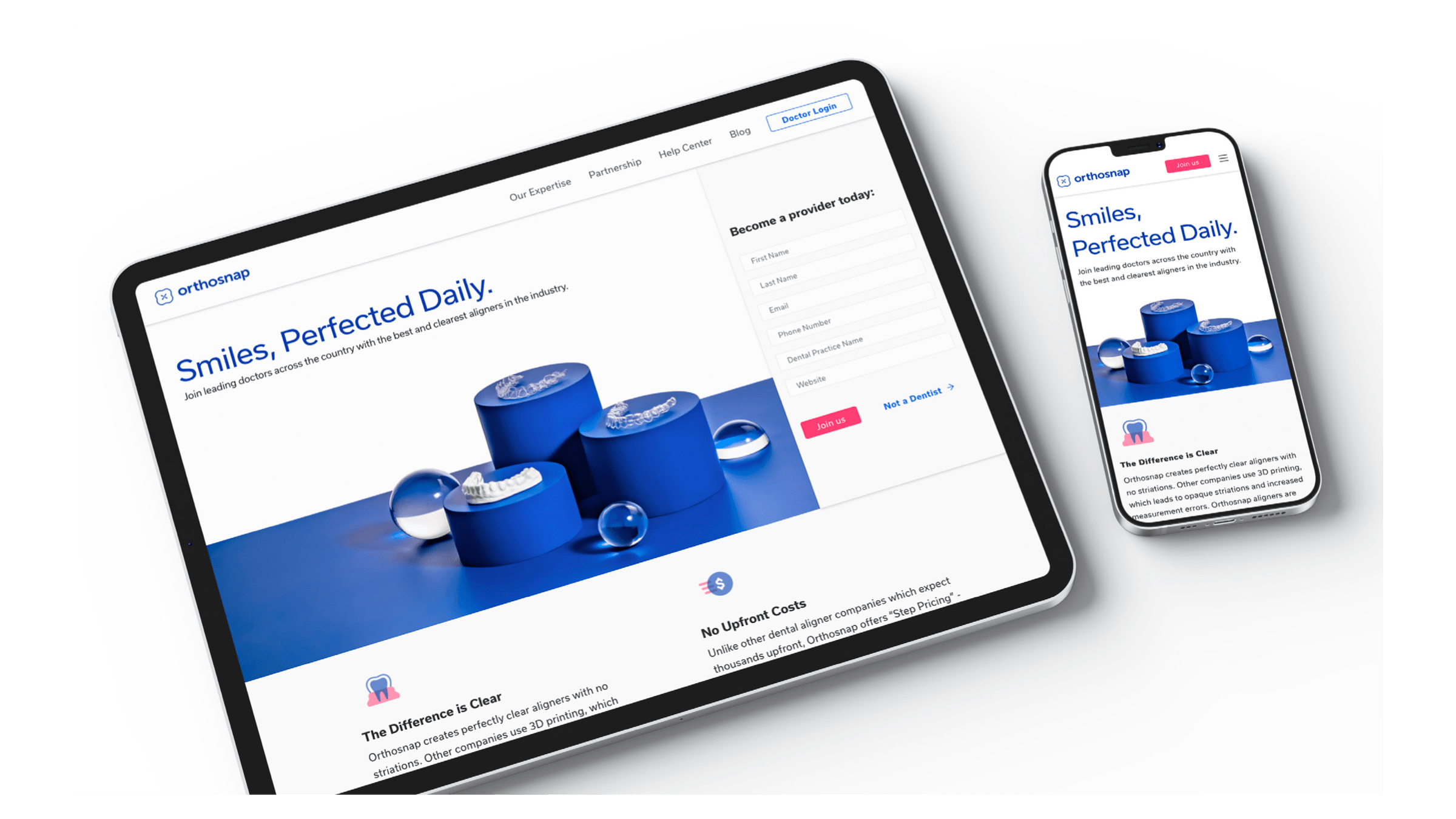
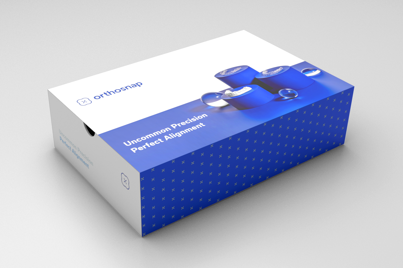
The deliverables for this rebrand included a complete brand guidelines book, iconography and illustration examples, product photography, website, stationery, and product packaging.