
Heavenly Hummus was started in the kitchen of Kathleen Tortora, a caterer on Long Island. The product—made with no preservatives and only five base ingredients—received praise from her clients, friends, and family. She was repeatedly urged to start selling a packaged product. After months of working with commercial kitchens to perfect the recipe for mass-production, Heavenly Hummus began appearing on supermarket shelves, and is now distributed throughout the greater New York City area.
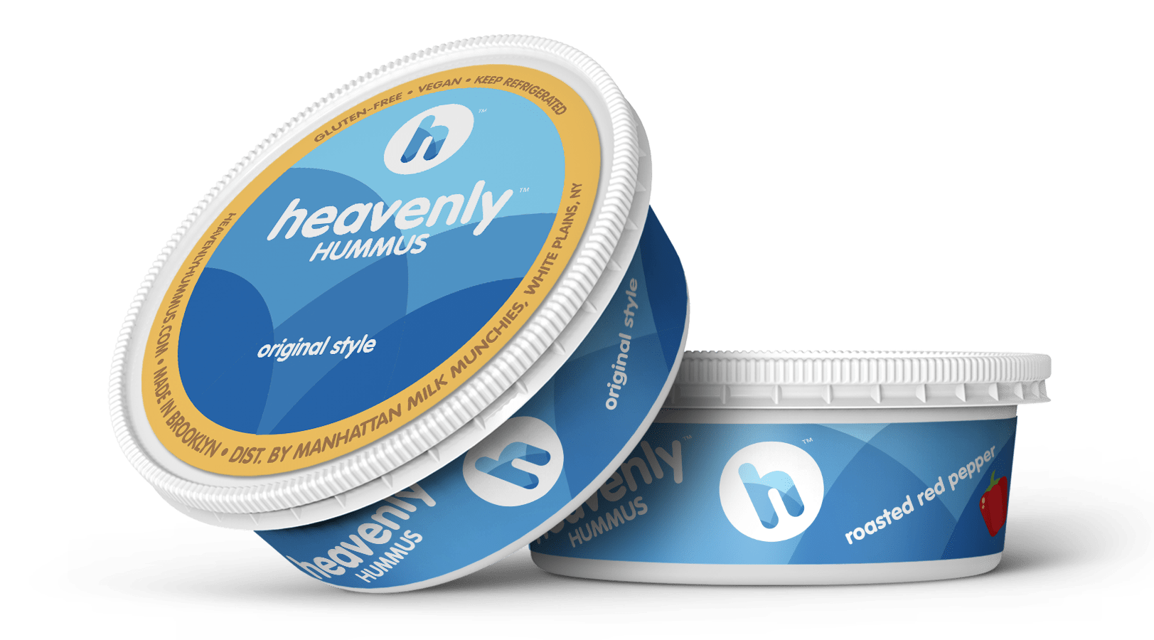
The Heavenly Hummus logo mark consists of a few overlapping circles of different shades of blue that visually resemble the sky, set inside a simple, friendly lower-case letter H. The concept behind the logo is to convey the simplicity of the product itself.
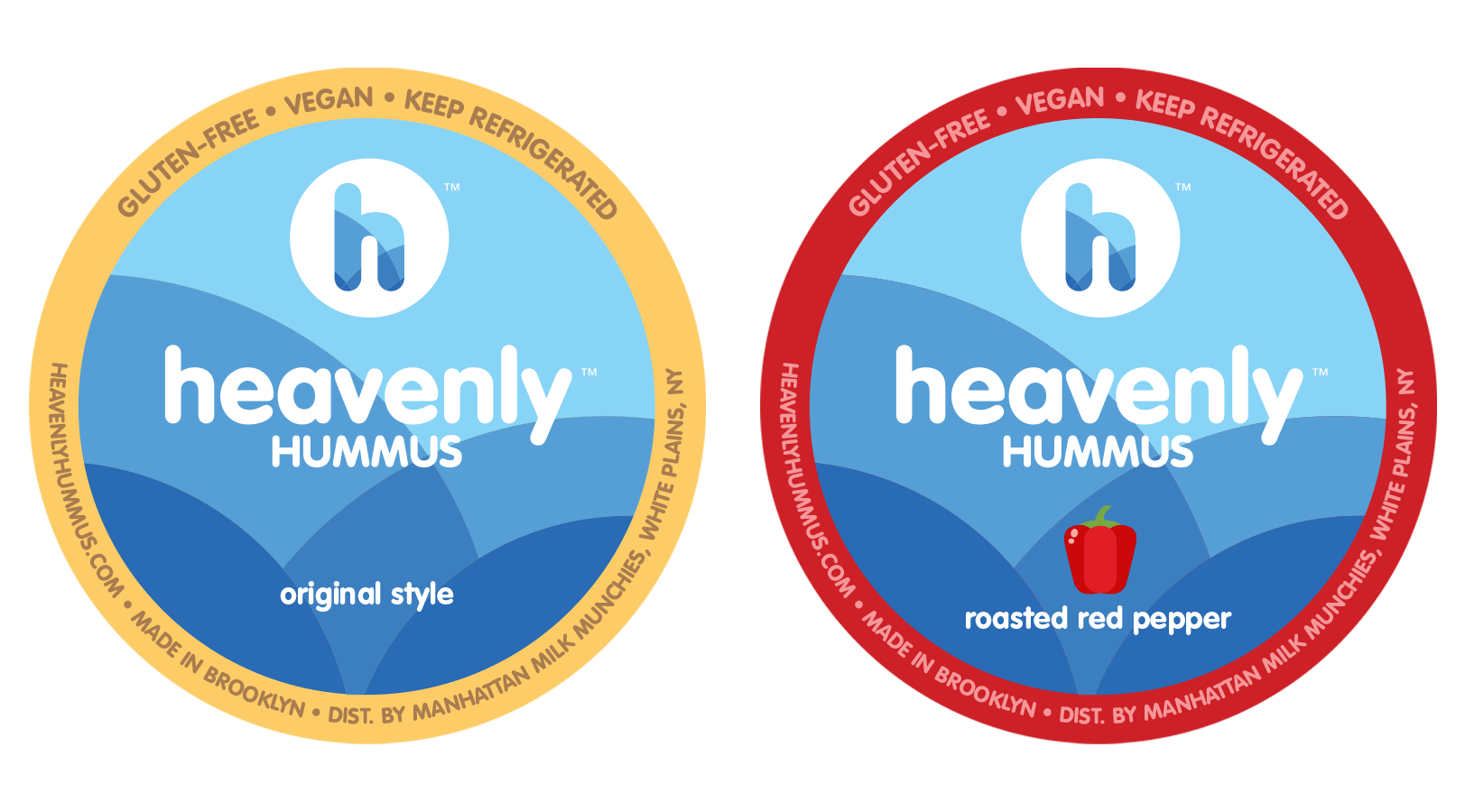
The color-coded package design extends the visual theme of the logo to become the label background.
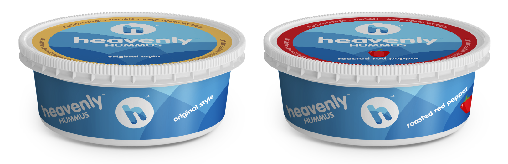
On a crowded supermarket shelf with many competing options, this label design is intended to capture a shopper’s attention, without being shouty or pretentious.